
As the year comes to a close, we're kicking off our Year-in-Review coverage with our annual "Worst Album Covers" list below — enjoy. Come back tomorrow (December 4) for the first in our series of Best of 2018 lists, the Top 20 Pop & Rock Albums of 2018, and check out last year's worst albums here.
The album cover has evolved to have two disparate functions — on the one hand, you need something that will stand out as a tiny icon in the "new releases" section of a streaming service. Simultaneously, however, you want an image that will work as a blown-up LP cover so that someone who doesn't even own a turntable will buy it and hang it up in their dorm room.
Complicating matters further, the LP cover is, like so much other culture, currently in the last gasp of its ironic phase, where ugly art is harder to critique because it was done on purpose. Whether it's Juice WRLD's child-like drawings or Earl Sweatshirt and Mark Kozelek's blurry cellphone pics, it's impossible to hate on bad art when it's being done on purpose.
That said, we had no trouble digging up dozens of nauseating album covers from the trenches of 2018. Below, you'll find the best of the worst.
21. Paul McCartney
Egypt Station
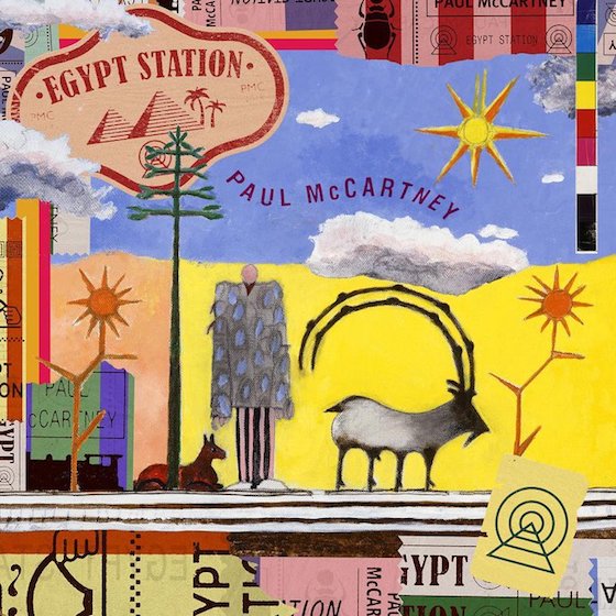
Anyone who's worked for a music magazine must have gotten PTSD when they first saw the cover for Paul McCartney's latest solo album — it looks exactly like every unsolicited promo CD mailed out in the history of time. You know the type: generic pop-rock with brief dalliances in "world music." It's the sort of album cover that one would use if they were an out-of-touch septuagenarian who wrote a sexed-up club jam called "Fuh You." Oh wait.
20. Sugar Candy Mountain
Do Right

With its corny, seafaring neon lights, tropical colours and what appears to be messy Christmas decorations, this album cover evokes a crowded stockroom at the back of an H&M menswear department on boxing day. What a stressful vibe.
19. Thunderpussy
Greatest Tits
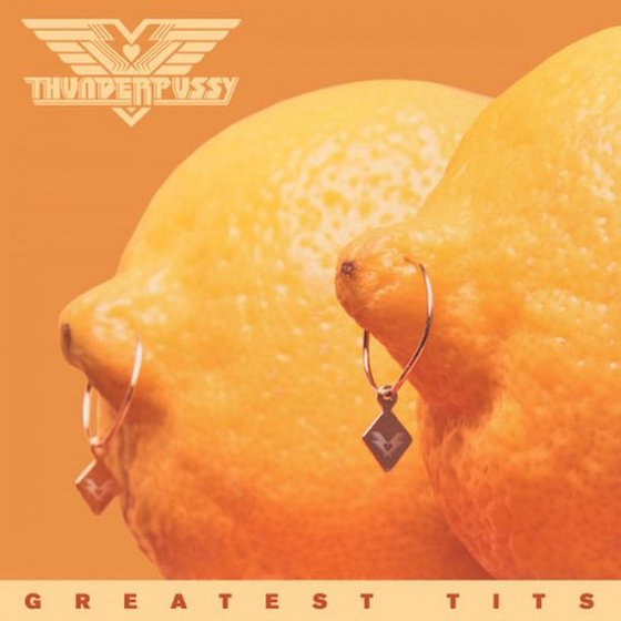
Album covers like this one make outlandish choices on purpose, as if they're daring the viewer to admit the image is bad. Fortunately, here at Exclaim! we pride ourselves on our bravery so we're down to say it — this image is bad! Also, Thunderpussy, you might want to go back to anatomy school because those are not actually breasts but in fact a pair of lemons. Joke's on you!
18. E-40
The Gift of Gab

Bay Area legend E-40 deserves far better than this. Even if you ignore the fact that there's already a California rapper named Gift of Gab, this overused title, and its lazy screenshot cover, is still underserved. It's quite literally the first result when you Google a definition of the phrase. The designer did the screenshot version of when you used to pad your book report by opening it with the Webster's definitions of "book" and "report."
17. Great Lake Swimmers
The Waves, The Wake
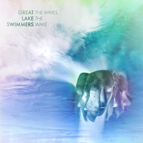
When you've released as many albums as Toronto folk rock act Great Lake Swimmers, you're bound to accidentally release something that looks like a discontinued Fruitopia flavour, some bad tropical gum or an all-over print that you'd find on a pair of off-brand swim trunks in a department store basement. And that's without mentioning the DeviantArt CGI masks in the corner or the ill-advised text placement that makes it look like a bad poem: "Great the waves, lake the swimmers wake." Damn, that's actually profound.
16. Krúbi
Nehézlábérzés

From child-like cartoons through deviations of standard mixtape art, there were plenty of rap covers that went to the end of good taste. In the case of Krúbi, a rapper signed to Universal Music Hungary, the lines are a little too blurry. It's hard to pinpoint where Krúbi crosses the line — maybe it's because of the garish mish-mash of oil paintings and stock art, or perhaps it's the half-eaten banana, or more likely the thick, murky pool of bodily fluid on the bedsheet. Whatever the case, it was brave of a major label to sign off on this.
15. Lil Wayne
Tha Carter V
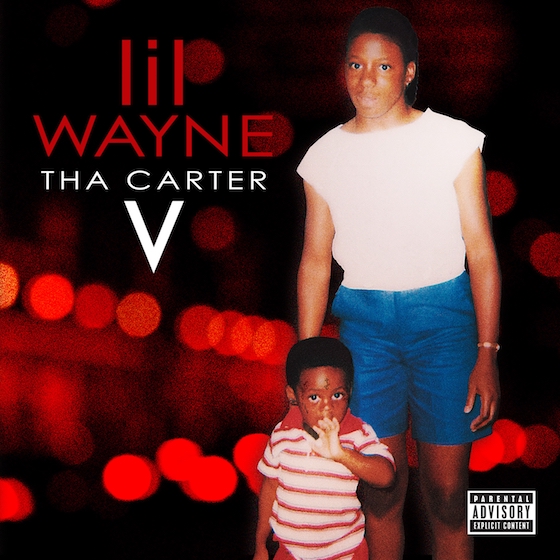
While everyone else was making cartoon rap covers, Lil Wayne's long-awaited comeback album arrived in a decidedly corny package. Don't blame the photo, either — Weezy's cover conventions, which have portrayed him as a tattooed child, are well established by now, and the photo of his mom is sweet. The real problem is the design, which pairs grainy bokeh lights with an absolutely garish combination of stretched-out lower- and uppercase letters. The end result is something that somehow looks like both a Hallmark card and a Hallmark movie.
14. Deadmau5
Where's the Drop?

"Where's the drop?" is a thing that EDM frat bros said, what, like 35 years ago? At least it feels that long. Anyway, terminally online producer Deadmau5 thought it'd be a good title for his compilation of, uh, orchestral Deadmau5 covers. It's so many bad things at once that it's almost good again, except for one problem — the end result looks like one of those t-shirts you'd get in Banff that says "Beware: Moose Droppings."
13. Reggie and the Full Effect
41
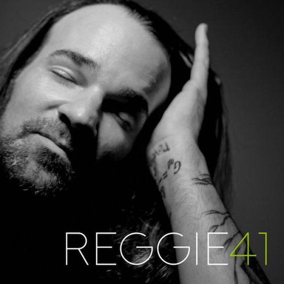
Album cover parodies are basically just memes at this point, and memes have decidedly short shelf lives. Considering the fact that Adele's 21 came out seven whole years ago, it's safe to say that people likely missed the joke on this cover choice. Not to mention that it's not much of a joke to begin with, just a reference to something else that makes your brain go "oh yeah, Adele" for a second. Ultimately, then, it just works as self-sabotage — if that's the cover, why bother with the songs?
12. Scrounche Boys
Letters from the Sperm Bank

After a quick Google to make sure this wasn't some sort of long lost Lonely Island project, we've confirmed that the Scrounche Boys are a real act. But don't let the band name or the album art or its title fool you — the Scrounche Boys are actually classy as all hell. They play a blend of modern jazz and hip-hop.
11. Mother Mother
Dance and Cry
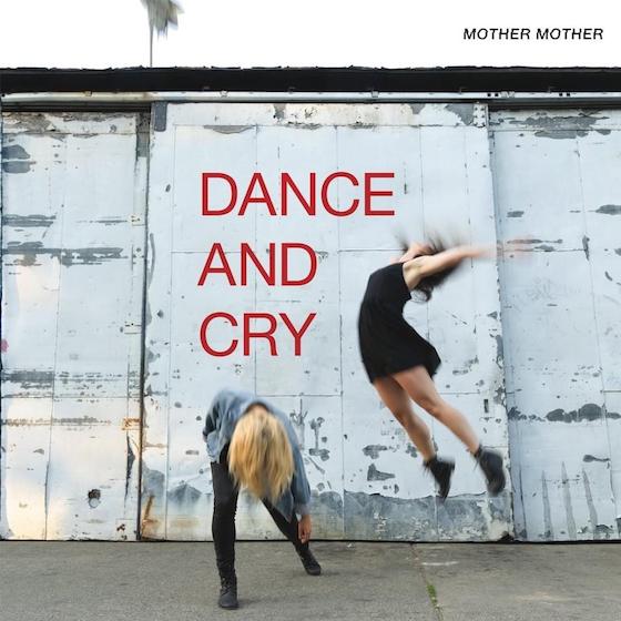
While the album cover that topped 2017's Worst Album Covers list was audaciously awful, this time around Mother Mother went back to playing it safe; for Dance and Cry, they paired an iPhone outtake and some aggressively plain text. Someone tell their designer to dig deeper in the app store — don't just use the first free "Album Cover Creator" you stumble across.
10. Otep
Kult 45

Y'know, they said the Trump era would produce great art. Maybe that will happen in the second half of his first term? So far, we've mostly been served up hamfisted post-Adbusters art like this cover from Los Angeles nu metal survivors Otep. This is the kind of image that one would be tempted to call a Banksy knockoff, but that feels like a cheap shot at Banksy. It's more like a Plastic Jesus or Mr. Brainwash knockoff. This is art for people who watch The Purge movies and conclude that we do in fact live in a society.
9. P.O.D.
Circles
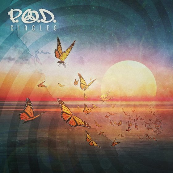
You know those removable wall decals that you can get at Home Depot? Or the dollar store? What if you put multiple packs of those on a wall? But what if instead of putting it on normal wallpaper, you put it on some HD wallpaper that you found in Google Image Search? Am I blowing your mind yet? P.O.D., a band whose logo on its own is already way too much, have gone off the deep end here.
8. Red or Dead
Trotsky Waltz

This is an album from a political folk-punk band from the UK. And I'm not even going to bother looking it up, because I can safely assume the non-Bandcamp version of this release was delivered in one of those flimsy cardboard CD sleeves. Either way, the album art actually serves a powerful purpose by fending off anyone who might be tempted to listen to it. And that's a good thing, because this is an album from a political folk-punk band from the UK.
7. Steve Aoki
Neon Future III
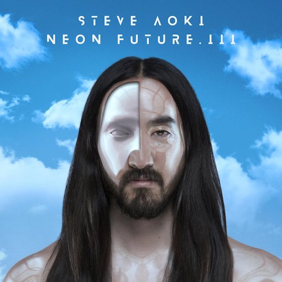
It's really sad to think about Steve Aoki's art trajectory. After all, the Dim Mak logo was sick, and he was a master of using messy, zine-like aesthetics in his early post-hardcore bands. But this new release is far from skramz — Aoki has gone full HD sheen, and he looks like some sort of futuristic cum cyborg.
6. Muse
Simulation Theory

Muse are a band for people who still use Windows Media Player, so it only makes sense that their latest album cover would be simultaneously retro, futuristic and irrelevant. From a distance, it looks like the standard out-of-touch synthwave aesthetic employed in freemium web games and back-to-school ads, but inspect more closely and you'll also notice werewolves and zombies and sports cars. And while go-to rock band punchline Greta Van Fleet chose the Stranger Things font for their album cover, Muse took things one step further and hired the show's damn poster artist to make this beast. It's all enough to make you regret ever enjoying pop culture from the 1980s.
5. Magic!
Expectations
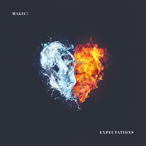
At the risk of being so rude, were there really many "expectations" for your new album, Magic!? After all, despite a handful of grocery store bops, the market is not exactly begging for Le Chateau-clad Canadian reggae-pop. Regardless, this collection of laid-back lite pop was delivered with some awkward all-caps typography and some imagery that simultaneously evokes Sweet Chili Heat Doritos and the latest Trojan lube creation. Those two ideas cannot peacefully coexist — no one should think about boning when they've got cheese dust on their fingers.
4. Mumford & Sons
Delta
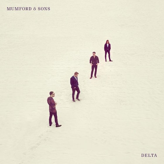
The saddest thing about Mumford & Sons is that if they had just stayed the path and kept making old-timey wedding reception folk we'd probably all love them by now. Instead, they've insecurely tried to become the next U2 and wound up about as relevant as the current U2. Look no further than the album cover for Delta — it's an album cover so album cover-y that you can tell they were trying to make the next big rock album. Instead, they've used frustratingly unfamiliar yet plain typefaces and stood in a perfect diagonal line, albeit with each member looking in a slightly different direction. If there's some sort of metaphor here, we don't want to know! Just bring back the suspenders and vests, we're sorry for making fun of you.
3. Neko Case
Hell-On

Look, there's no question that some well-paid modern artist theorized and belaboured the hell out of this cig-adorned Neko Case album cover. And, uh, if you're into that sort of thing, you probably think the artist did a great job. But the reality is, this bizarre fringe festival-esque art piece makes the whole album look like a joke. It's the sort of album [editor's note: very good album] that would be brought up as a punchline if Neko Case's music was the subject of a fictional mockumentary. "Yeah, the Hell-On years were some real dark years," Russell Brand would say as this monstrosity popped onscreen for cheap laughs.
2. Ana Cañas
TODXS

Look, Ana, I'm no doctor but I think something has gone horribly wrong with your genitals. Then again, this cover does work well with the album title, which is precisely what I typed when I first saw it: TODXSa;/sulghlaaWOAIJRE.
1. Kanye West
ye

To be clear, Kanye West's most recent album cover does fit the product. After all, it's simultaneously lazy and sophomoric — an attempt to break the mould and create something abrupt that actually comes across as shitty and out of touch. The caption, a sort of yuk-yuking maxim one would find on a coaster in a gift shop that also sells "Body By Tacos" tanktops, looks particularly jarring atop a user-generated photograph of Jackson Hole. In a year where so many artists were toying with the idea of "so bad it's good," Kanye reminded us that there's still such a thing as just "so bad."
The album cover has evolved to have two disparate functions — on the one hand, you need something that will stand out as a tiny icon in the "new releases" section of a streaming service. Simultaneously, however, you want an image that will work as a blown-up LP cover so that someone who doesn't even own a turntable will buy it and hang it up in their dorm room.
Complicating matters further, the LP cover is, like so much other culture, currently in the last gasp of its ironic phase, where ugly art is harder to critique because it was done on purpose. Whether it's Juice WRLD's child-like drawings or Earl Sweatshirt and Mark Kozelek's blurry cellphone pics, it's impossible to hate on bad art when it's being done on purpose.
That said, we had no trouble digging up dozens of nauseating album covers from the trenches of 2018. Below, you'll find the best of the worst.
21. Paul McCartney
Egypt Station
Anyone who's worked for a music magazine must have gotten PTSD when they first saw the cover for Paul McCartney's latest solo album — it looks exactly like every unsolicited promo CD mailed out in the history of time. You know the type: generic pop-rock with brief dalliances in "world music." It's the sort of album cover that one would use if they were an out-of-touch septuagenarian who wrote a sexed-up club jam called "Fuh You." Oh wait.
20. Sugar Candy Mountain
Do Right
With its corny, seafaring neon lights, tropical colours and what appears to be messy Christmas decorations, this album cover evokes a crowded stockroom at the back of an H&M menswear department on boxing day. What a stressful vibe.
19. Thunderpussy
Greatest Tits
Album covers like this one make outlandish choices on purpose, as if they're daring the viewer to admit the image is bad. Fortunately, here at Exclaim! we pride ourselves on our bravery so we're down to say it — this image is bad! Also, Thunderpussy, you might want to go back to anatomy school because those are not actually breasts but in fact a pair of lemons. Joke's on you!
18. E-40
The Gift of Gab
Bay Area legend E-40 deserves far better than this. Even if you ignore the fact that there's already a California rapper named Gift of Gab, this overused title, and its lazy screenshot cover, is still underserved. It's quite literally the first result when you Google a definition of the phrase. The designer did the screenshot version of when you used to pad your book report by opening it with the Webster's definitions of "book" and "report."
17. Great Lake Swimmers
The Waves, The Wake
When you've released as many albums as Toronto folk rock act Great Lake Swimmers, you're bound to accidentally release something that looks like a discontinued Fruitopia flavour, some bad tropical gum or an all-over print that you'd find on a pair of off-brand swim trunks in a department store basement. And that's without mentioning the DeviantArt CGI masks in the corner or the ill-advised text placement that makes it look like a bad poem: "Great the waves, lake the swimmers wake." Damn, that's actually profound.
16. Krúbi
Nehézlábérzés
From child-like cartoons through deviations of standard mixtape art, there were plenty of rap covers that went to the end of good taste. In the case of Krúbi, a rapper signed to Universal Music Hungary, the lines are a little too blurry. It's hard to pinpoint where Krúbi crosses the line — maybe it's because of the garish mish-mash of oil paintings and stock art, or perhaps it's the half-eaten banana, or more likely the thick, murky pool of bodily fluid on the bedsheet. Whatever the case, it was brave of a major label to sign off on this.
15. Lil Wayne
Tha Carter V
While everyone else was making cartoon rap covers, Lil Wayne's long-awaited comeback album arrived in a decidedly corny package. Don't blame the photo, either — Weezy's cover conventions, which have portrayed him as a tattooed child, are well established by now, and the photo of his mom is sweet. The real problem is the design, which pairs grainy bokeh lights with an absolutely garish combination of stretched-out lower- and uppercase letters. The end result is something that somehow looks like both a Hallmark card and a Hallmark movie.
14. Deadmau5
Where's the Drop?
"Where's the drop?" is a thing that EDM frat bros said, what, like 35 years ago? At least it feels that long. Anyway, terminally online producer Deadmau5 thought it'd be a good title for his compilation of, uh, orchestral Deadmau5 covers. It's so many bad things at once that it's almost good again, except for one problem — the end result looks like one of those t-shirts you'd get in Banff that says "Beware: Moose Droppings."
13. Reggie and the Full Effect
41
Album cover parodies are basically just memes at this point, and memes have decidedly short shelf lives. Considering the fact that Adele's 21 came out seven whole years ago, it's safe to say that people likely missed the joke on this cover choice. Not to mention that it's not much of a joke to begin with, just a reference to something else that makes your brain go "oh yeah, Adele" for a second. Ultimately, then, it just works as self-sabotage — if that's the cover, why bother with the songs?
12. Scrounche Boys
Letters from the Sperm Bank
After a quick Google to make sure this wasn't some sort of long lost Lonely Island project, we've confirmed that the Scrounche Boys are a real act. But don't let the band name or the album art or its title fool you — the Scrounche Boys are actually classy as all hell. They play a blend of modern jazz and hip-hop.
11. Mother Mother
Dance and Cry
While the album cover that topped 2017's Worst Album Covers list was audaciously awful, this time around Mother Mother went back to playing it safe; for Dance and Cry, they paired an iPhone outtake and some aggressively plain text. Someone tell their designer to dig deeper in the app store — don't just use the first free "Album Cover Creator" you stumble across.
10. Otep
Kult 45
Y'know, they said the Trump era would produce great art. Maybe that will happen in the second half of his first term? So far, we've mostly been served up hamfisted post-Adbusters art like this cover from Los Angeles nu metal survivors Otep. This is the kind of image that one would be tempted to call a Banksy knockoff, but that feels like a cheap shot at Banksy. It's more like a Plastic Jesus or Mr. Brainwash knockoff. This is art for people who watch The Purge movies and conclude that we do in fact live in a society.
9. P.O.D.
Circles
You know those removable wall decals that you can get at Home Depot? Or the dollar store? What if you put multiple packs of those on a wall? But what if instead of putting it on normal wallpaper, you put it on some HD wallpaper that you found in Google Image Search? Am I blowing your mind yet? P.O.D., a band whose logo on its own is already way too much, have gone off the deep end here.
8. Red or Dead
Trotsky Waltz
This is an album from a political folk-punk band from the UK. And I'm not even going to bother looking it up, because I can safely assume the non-Bandcamp version of this release was delivered in one of those flimsy cardboard CD sleeves. Either way, the album art actually serves a powerful purpose by fending off anyone who might be tempted to listen to it. And that's a good thing, because this is an album from a political folk-punk band from the UK.
7. Steve Aoki
Neon Future III
It's really sad to think about Steve Aoki's art trajectory. After all, the Dim Mak logo was sick, and he was a master of using messy, zine-like aesthetics in his early post-hardcore bands. But this new release is far from skramz — Aoki has gone full HD sheen, and he looks like some sort of futuristic cum cyborg.
6. Muse
Simulation Theory
Muse are a band for people who still use Windows Media Player, so it only makes sense that their latest album cover would be simultaneously retro, futuristic and irrelevant. From a distance, it looks like the standard out-of-touch synthwave aesthetic employed in freemium web games and back-to-school ads, but inspect more closely and you'll also notice werewolves and zombies and sports cars. And while go-to rock band punchline Greta Van Fleet chose the Stranger Things font for their album cover, Muse took things one step further and hired the show's damn poster artist to make this beast. It's all enough to make you regret ever enjoying pop culture from the 1980s.
5. Magic!
Expectations
At the risk of being so rude, were there really many "expectations" for your new album, Magic!? After all, despite a handful of grocery store bops, the market is not exactly begging for Le Chateau-clad Canadian reggae-pop. Regardless, this collection of laid-back lite pop was delivered with some awkward all-caps typography and some imagery that simultaneously evokes Sweet Chili Heat Doritos and the latest Trojan lube creation. Those two ideas cannot peacefully coexist — no one should think about boning when they've got cheese dust on their fingers.
4. Mumford & Sons
Delta
The saddest thing about Mumford & Sons is that if they had just stayed the path and kept making old-timey wedding reception folk we'd probably all love them by now. Instead, they've insecurely tried to become the next U2 and wound up about as relevant as the current U2. Look no further than the album cover for Delta — it's an album cover so album cover-y that you can tell they were trying to make the next big rock album. Instead, they've used frustratingly unfamiliar yet plain typefaces and stood in a perfect diagonal line, albeit with each member looking in a slightly different direction. If there's some sort of metaphor here, we don't want to know! Just bring back the suspenders and vests, we're sorry for making fun of you.
3. Neko Case
Hell-On
Look, there's no question that some well-paid modern artist theorized and belaboured the hell out of this cig-adorned Neko Case album cover. And, uh, if you're into that sort of thing, you probably think the artist did a great job. But the reality is, this bizarre fringe festival-esque art piece makes the whole album look like a joke. It's the sort of album [editor's note: very good album] that would be brought up as a punchline if Neko Case's music was the subject of a fictional mockumentary. "Yeah, the Hell-On years were some real dark years," Russell Brand would say as this monstrosity popped onscreen for cheap laughs.
2. Ana Cañas
TODXS
Look, Ana, I'm no doctor but I think something has gone horribly wrong with your genitals. Then again, this cover does work well with the album title, which is precisely what I typed when I first saw it: TODXSa;/sulghlaaWOAIJRE.
1. Kanye West
ye
To be clear, Kanye West's most recent album cover does fit the product. After all, it's simultaneously lazy and sophomoric — an attempt to break the mould and create something abrupt that actually comes across as shitty and out of touch. The caption, a sort of yuk-yuking maxim one would find on a coaster in a gift shop that also sells "Body By Tacos" tanktops, looks particularly jarring atop a user-generated photograph of Jackson Hole. In a year where so many artists were toying with the idea of "so bad it's good," Kanye reminded us that there's still such a thing as just "so bad."


