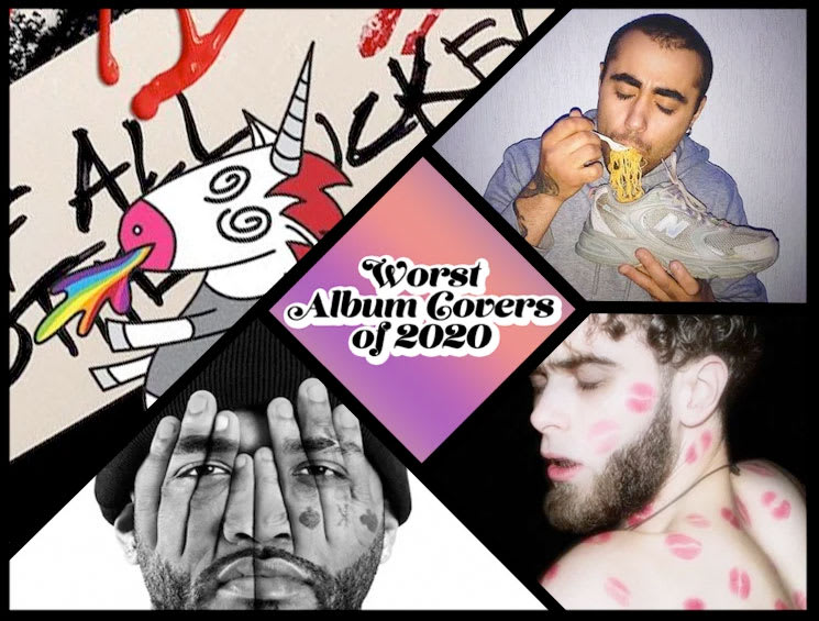
Culture, art and life itself are constantly shifting all around us in myriad ways, and in 2020 more so than ever before. Trends bubble up and burst, aesthetics shift and ideas eat their own tails. Life is so confusing right now, that the lines between "good" and "bad" have never been more blurry. It can often feel like all art is both good and bad, depending on how you look at it. Further, as you read this article you might be asking, why point out even more badness in a year that was already oh so bad?
Well, dear reader, scroll down and you'll immediately begin to understand. Even when things feel universally shitty, we can take some strange comfort in the knowledge that objectively awful aesthetics still exist. And if there's true badness in the world, that must mean that somewhere there is true goodness, too.
Below, you'll find the 33 worst album covers of 2020. (And while you're at it, revisit the worst album covers from 2016, 2017, 2018 and 2019.)
33. Balloon Pilot
Blankets
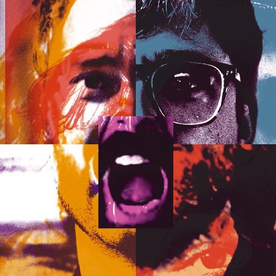
The medium du jour, to be sure, collages abound throughout 2020's album art. There were so many of them that they almost entirely transcended notions of good or bad, instead squishing together like one junior high scrapbooking project that made our fingers feel sticky and our heads ache from phantom glue fumes. Still, Balloon Pilot warrants inclusion with the art for Blankets because the image somehow looks like every release in a record store discount bin at once.
32. Pascal Plantinga
Blind on Bikini

Are we to infer that the strategically placed pink hibiscus represents a pudenda, with the sea-swept mountain range a pair of breasts? Somehow that's the best case scenario for this album cover, which otherwise looks like a free calendar that would be handed out at a medical clinic to promote healthy gut flora for patients in their 50s and upward.
31. Floral
Floral
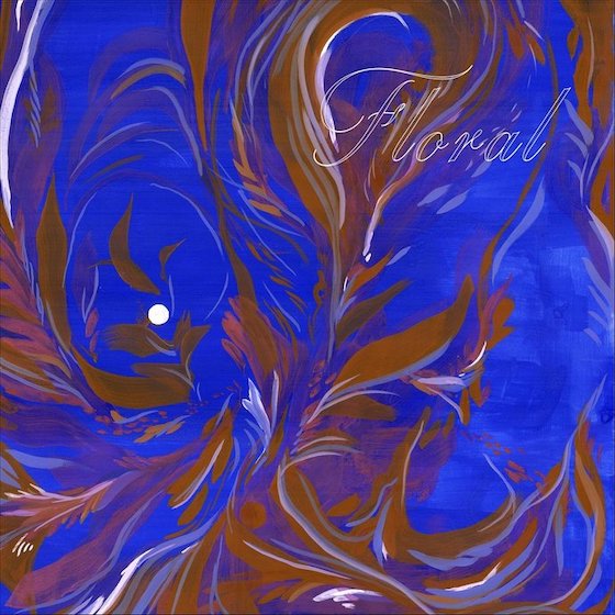
Then again, maybe the purpose of album covers in 2020 was to make us despise flowers in every form? This blue and brown monstrosity looks like a consigned painting that'd be hanging in a second-wave coffee shop after said shop had been exposed to a grisly sewage leak.
30. Dead Sheeran
Dead Sheeran

The Breaking Bad colour scheme and tacky Gen X typewriter font are just bad enough to work with the eye-roll worthy band name, but look a little closer. Is that… is that Mark Kozelek?!
29. Glowbug
Vampire Empire
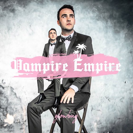
What if you took all the fun out of ventriloquism and replaced its jokes with some sort of evil, pupil-less dandy businessman, then overlayed it with some 2009-wave MySpace emo text? It's hard to even imagine what this album sounds like, but we're too scared to find out.
28. Gorilla Zoe
31 Days of COVID-19

Like correctly worn facemasks themselves, everything in 2020 felt a little on the nose. That's why Gorilla Zoe almost deserves props for zooming out a little. Rather than capture the zeitgeist with something distinctively present-day, he went for a more classic "twisted" look involving fan art from A Clockwork Orange, The Silence of the Lambs and The Dark Knight. Still, no one should ever, ever, ever write out the phrase "COVID-19" in Chalkduster font.
27. Sieben
2020 Vision

And here's what happens when you go über topical — the art for 2020 Vision looks like the kind of deepfried deep web meme that would accompany a terrifying manifesto, complete with itchy digital decay and deviously dystopian mashups of stock photos. There's so much going on that you almost don't even notice the Guy Fawkes mask, or maybe your brain just skips that detail over because the whole image really feels like one big Guy Fawkes mask either way.
26. J. Sands
ABORVFT

Text is, obviously, one of the most persuasive and powerful vehicles to get a message across. And letting text speak on its own can be incredibly evocative. But if you're going to put stark white text on a pitch black background, you might want to flip through the available fonts on your phone so that it's not the same Impact typography we all associate with the word "ERMAHGERD." Further, it's probably a good idea to double check the grammar so that your entire album cover isn't just the phrase "A Bunch of Racist Voted for Trump."
25. Ramos
My Many Sides
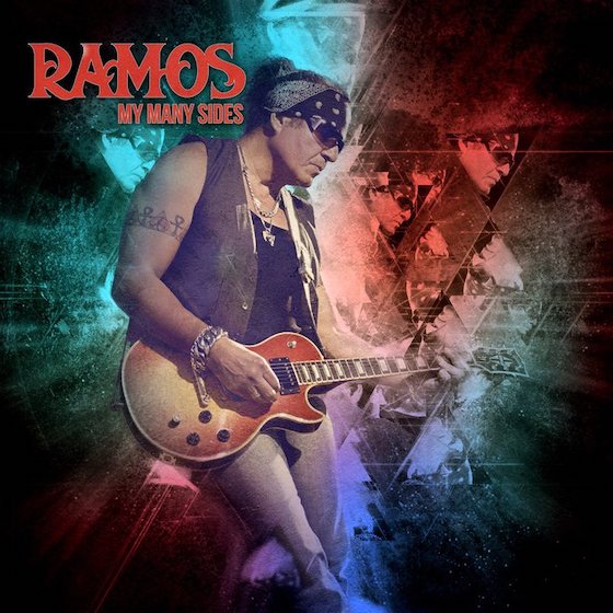
Our first impression of My Many Sides is that it's an incredibly tacky, over-designed mess. Look a little closer, however, and the art betrays the title. Ramos' "many sides" are, in fact, just his right side, which has been copied and pasted numerous times and placed inside of some cosmic triangles. If anything, this album cover has us desperate to see him turn the other cheek.
24. Zorbonauts
The Unobserved Beaver

There are album covers that don't work because they don't accurately express the contents within, but this 1997 Reader's Digest editorial cartoon-looking artwork almost definitely does represent whatever sound is being blasted out by a band called Zorbonauts. We're guessing it's probably some jazz-rock fusion, but the band logo is another misdirect because it references both the Who and… freestyle breakdancing?!
23. Belle and Sebastian
What to Look for in Summer
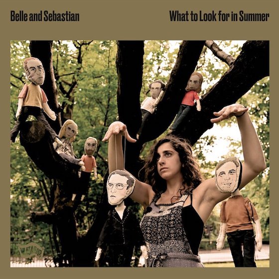
It happened so gradually that we almost didn't even realize that proper twee pop legends Belle and Sebastian had fully morphed into some ungodly hybrid of the Decemberists and Gogol Bordello. Too many afternoon sets on the folk fest circuit will do that to you.
22. Oh Sees
Panther Rotate

Maybe it's not John Dwyer's fault. After all, when you release as many Oh Sees/OCs/Thee Oh Sees/etc. albums as he has, you're bound to eventually wind up with an album cover that is a meticulously detailed watercolour painting of a cat's gaping red asshole and dangly nutsack.
21. Freddie Gibbs and the Alchemist
Alfredo
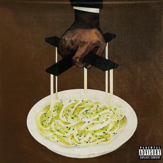
To be clear, Alfredo was a career-high moment from both Freddie Gibbs and Alchemist, marrying both of their skills in sheer perfection. But we can't help but wonder what this album art is trying to say. After all, the marionette pulling the strings is a trope often reserved for New World Order imagery. Is this a political cartoon about pasta consumption? Are carbs somehow tied to the deep state? Is ketosis the only way to know true freedom?
20. Steve Flato
Wisdom Teeth

Freddie Gibbs wasn't the only artist with noodles on the brain. In fact, Steve Flato looks like his entire head is made up of spaghetti on this cover that depicts a pair of spectacles deep in the sauce. It'd have been a half decent IG story — hell maybe even a good wall post — but is this really album cover material?
19. Musica Di Strada
Домашний

What is with the incongruous noodle micro-trend of 2020? Here we see Musica Di Strada mowing down some ramen out of a New Balance shoe that is just broken-in enough to suggest he didn't need the flavour packet. Is he some sort of sneaker freak foot fetishist who wants people to send noods? Perhaps, or maybe he just can't afford any dinnerware — he is using a plastic fork after all.
18. Недры
СИТУАЦИЯ
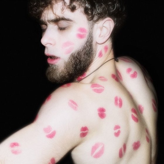
An album cover is a pristine opportunity to engage in some tried-and-true braggadoccio, and Недры has taken the opportunity to really hammer the point home: you think you get more smooches than Недры? His life is just an endless sea of freshly rouged lips, laying smackeroos on him at all times. He can't even get changed into a fresh shirt without drowning in Xs and Os, his life a hellish waking nightmare of puckered lips and sultry pecks. My man gets kisses.
17. Scandal
Kiss from the Darkness

There are album covers that suck for a reason, and then there are album covers that are so bad they leave the viewer in awe. Take a moment and lose yourself in the details: the melted butter at the bottom of the dish, the daisy delicately placed inside of the poultry-esque heart rested atop the unsuspecting toddler's head, the yellow S that makes the artist name look like it says "CANDAL." This looks like Baz Luhrman trying to be Lynchian.
16. The Arcana
Mesmer Theatre
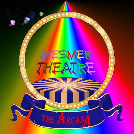
Modern life is so confusing. With its saturated, eye-straining mess of colours, the Mesmer Theatre cover is undeniably perfect in a 2020 context. And if this were a Bandcamp shitpost in the post-Gecs music sphere, it'd be an absolutely fitting work with its garish text and terrifying little faces haunting the corner. Knowing that this is the album art for a long-running British rock band somehow just makes the image all the more upsetting.
15. Posehn
Grandpa Metal

Metal album covers exist in a different realm, where seemingly no amount of cheese can prevent them from thriving. Often, the sillier a metal cover is, the more metal it actually is — or so it seems from the outside. But there's something about the knowledge that this is a comedy metal album that makes the imagery, title, text and general vibe so much more depressing.
14. Anvil
Legal at Last

Scratch that — maybe there is a maximum cheese ceiling when it comes to metal album covers, and Anvil have completely broken through with the cover for Legal at Last. This looks like a fictional Spinal Tap album cover that would have been used like 20 years after the Spinal Tap movie for a depressing telethon reunion that felt like it was half-written and cobbled together 15 minutes before it went on air.
13. Biffy Clyro
A Celebration of Endings

This album art is actually a comprehensive and all-encompassing tableau of cultural signifiers that captures the pulse of the zeitgeist (if you haven't left your house or experienced anything of note since approximately 2004).
12. Elvis Costello
Hey Clockface
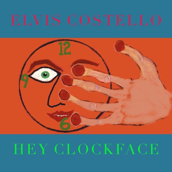
You either die a cool new waver or live long enough to become a blues dad. This looks like it was designed to be bubble jet printed on the home computer, then slid into a plastic sleeve with a home-burned CD-R and hawked for $20 a piece at an uncomfortable family gathering. Extra points for the colour scheme, which seems to break every computer's graphics card no matter how hi-res the jpeg.
11. Bob Dylan
Rough and Rowdy Ways

Bob Dylan is nearly 60 years into his career and has released dozens of unspeakably acclaimed albums, so it'd be inappropriate to tell him how to do his job. Then again, this fake vintage album cover looks like some shit you'd find in a boomer Facebook group between Minion memes that suggest COVID is a hoax and digitally distorted animated GIFs of the "hang in there" cat.
10. William Shatner
The Blues

Captain Kirk tried to teleport while one of his middle-aged shipmates was downloading some HD wallpapers to their computer, and now he's trapped inside a website full of fairies and unicorns. He can't escape unless he forwards a chain email about how angels are real to 15 of his closest friends.
9. Dave Brons
Not All Those Who Wander Are Lost
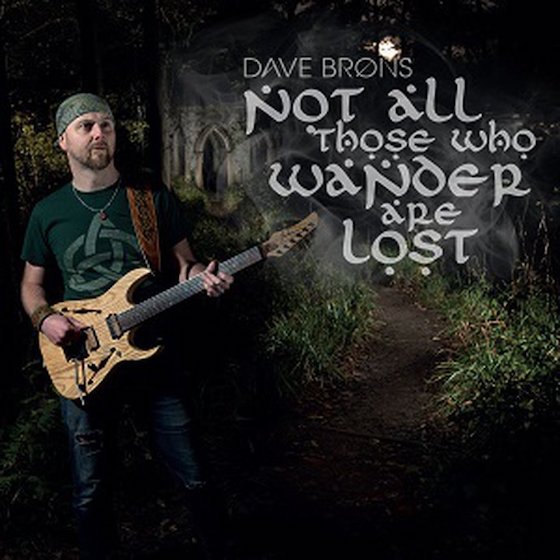
Not all those who wander are lost, and not all who make Celtic rock have terrible album covers. Two maxims that are true in the theoretical but rarely true in practice.
8. General Stratocuster and the Marshals
Get a Lawyer

There are few things as daunting as the realization that you need to seek professional legal help, but that dread is made a thousand times worse upon the realization that Lady Justice is a person that probably goes to Burning Man.
7. Killah Priest and Jordan River Banks
The Third Eye in Technicolor

This is like a Magic Eye poster except instead of taking a few moments to see a hidden image, you're confronted with every colour, image, design trick and visual idea at once. It's a pure retinal assault, and it's hard to even believe there is an album title buried in there too.
6. Bush
The Kingdom

Skeletons and the like are obviously cool as hell, but something about this album cover feels like the photographer bought X-ray specs and went down the local ballet recital. Do better, Gavin.
5. Somos La Herencia
Dolo
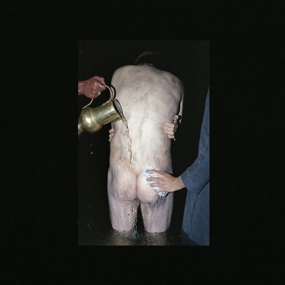
It's a terrible album cover, but at least this image serves as a solid reminder to go wash your ass. Seriously, take a break from reading this and go scrub it down. Get right in there. You can't really get that thing too clean.
4. Joyner Lucas
ADHD

This is what happens if the wind changes direction while you're burying your face in your hands out of existential dread. So maybe it's a pretty good representation of modern life, even if it is creepy as all hell.
3. Salvatore Ganacci
Boycycle EP
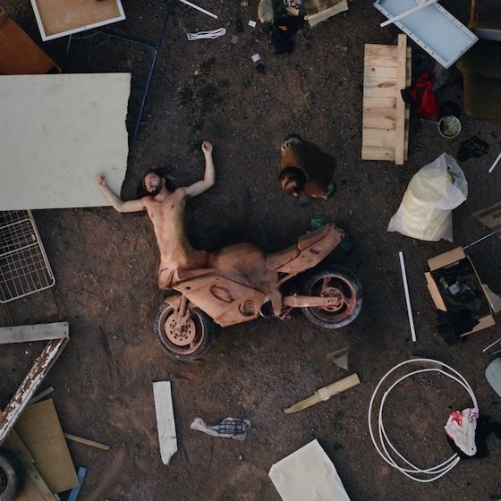
On the one hand, it feels unfair to rank an EP cover so high on this list, considering that EPs are traditionally a different medium from full-length albums and allow for more experimentation and thinking outside the box. On the other hand, someone put many hours into making this guy look like a fleshy centaur motorbike and didn't even let him have the satisfaction of staying upright on the cover. This brings new meaning to the phrase "crotch rocket."
2. Mental Abortion
Abort Your Mind

I'm no doctor, but it appears the "mind" in question has actually been brought to term and successfully birthed via the vaginal canal. Further, and not to split hairs, but is a brain on display a mind in and of itself, or is the mind something deeper within? And also why did they have to make this image for all of us to see?
1. Green Day
Father of All Motherfuckers
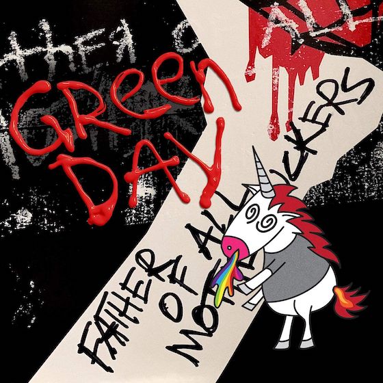
The roll out for Green Day's sassy, limply "proto-punk" 2020 album, Father of All Motherfuckers, was so gratingly corny that, despite some critics enjoying the music, many fans actually believed the whole thing was an elaborate troll for the band to fuck over Reprise Records. It takes a lot to make something so awful that fans invent an entire conspiracy theory in order to process the badness, and a lot of that can be attributed to the horrifying abomination that is this cover. This monstrosity — a mix of gel pen text and image placement befitting of one of those free online Photoshop clones — was designed by Billie Joe Armstrong himself. And despite its flaws, it still cements the band in the punk history books right alongside Black Flag.
Well, dear reader, scroll down and you'll immediately begin to understand. Even when things feel universally shitty, we can take some strange comfort in the knowledge that objectively awful aesthetics still exist. And if there's true badness in the world, that must mean that somewhere there is true goodness, too.
Below, you'll find the 33 worst album covers of 2020. (And while you're at it, revisit the worst album covers from 2016, 2017, 2018 and 2019.)
33. Balloon Pilot
Blankets

The medium du jour, to be sure, collages abound throughout 2020's album art. There were so many of them that they almost entirely transcended notions of good or bad, instead squishing together like one junior high scrapbooking project that made our fingers feel sticky and our heads ache from phantom glue fumes. Still, Balloon Pilot warrants inclusion with the art for Blankets because the image somehow looks like every release in a record store discount bin at once.
32. Pascal Plantinga
Blind on Bikini

Are we to infer that the strategically placed pink hibiscus represents a pudenda, with the sea-swept mountain range a pair of breasts? Somehow that's the best case scenario for this album cover, which otherwise looks like a free calendar that would be handed out at a medical clinic to promote healthy gut flora for patients in their 50s and upward.
31. Floral
Floral

Then again, maybe the purpose of album covers in 2020 was to make us despise flowers in every form? This blue and brown monstrosity looks like a consigned painting that'd be hanging in a second-wave coffee shop after said shop had been exposed to a grisly sewage leak.
30. Dead Sheeran
Dead Sheeran

The Breaking Bad colour scheme and tacky Gen X typewriter font are just bad enough to work with the eye-roll worthy band name, but look a little closer. Is that… is that Mark Kozelek?!
29. Glowbug
Vampire Empire

What if you took all the fun out of ventriloquism and replaced its jokes with some sort of evil, pupil-less dandy businessman, then overlayed it with some 2009-wave MySpace emo text? It's hard to even imagine what this album sounds like, but we're too scared to find out.
28. Gorilla Zoe
31 Days of COVID-19

Like correctly worn facemasks themselves, everything in 2020 felt a little on the nose. That's why Gorilla Zoe almost deserves props for zooming out a little. Rather than capture the zeitgeist with something distinctively present-day, he went for a more classic "twisted" look involving fan art from A Clockwork Orange, The Silence of the Lambs and The Dark Knight. Still, no one should ever, ever, ever write out the phrase "COVID-19" in Chalkduster font.
27. Sieben
2020 Vision

And here's what happens when you go über topical — the art for 2020 Vision looks like the kind of deepfried deep web meme that would accompany a terrifying manifesto, complete with itchy digital decay and deviously dystopian mashups of stock photos. There's so much going on that you almost don't even notice the Guy Fawkes mask, or maybe your brain just skips that detail over because the whole image really feels like one big Guy Fawkes mask either way.
26. J. Sands
ABORVFT

Text is, obviously, one of the most persuasive and powerful vehicles to get a message across. And letting text speak on its own can be incredibly evocative. But if you're going to put stark white text on a pitch black background, you might want to flip through the available fonts on your phone so that it's not the same Impact typography we all associate with the word "ERMAHGERD." Further, it's probably a good idea to double check the grammar so that your entire album cover isn't just the phrase "A Bunch of Racist Voted for Trump."
25. Ramos
My Many Sides

Our first impression of My Many Sides is that it's an incredibly tacky, over-designed mess. Look a little closer, however, and the art betrays the title. Ramos' "many sides" are, in fact, just his right side, which has been copied and pasted numerous times and placed inside of some cosmic triangles. If anything, this album cover has us desperate to see him turn the other cheek.
24. Zorbonauts
The Unobserved Beaver

There are album covers that don't work because they don't accurately express the contents within, but this 1997 Reader's Digest editorial cartoon-looking artwork almost definitely does represent whatever sound is being blasted out by a band called Zorbonauts. We're guessing it's probably some jazz-rock fusion, but the band logo is another misdirect because it references both the Who and… freestyle breakdancing?!
23. Belle and Sebastian
What to Look for in Summer

It happened so gradually that we almost didn't even realize that proper twee pop legends Belle and Sebastian had fully morphed into some ungodly hybrid of the Decemberists and Gogol Bordello. Too many afternoon sets on the folk fest circuit will do that to you.
22. Oh Sees
Panther Rotate

Maybe it's not John Dwyer's fault. After all, when you release as many Oh Sees/OCs/Thee Oh Sees/etc. albums as he has, you're bound to eventually wind up with an album cover that is a meticulously detailed watercolour painting of a cat's gaping red asshole and dangly nutsack.
21. Freddie Gibbs and the Alchemist
Alfredo

To be clear, Alfredo was a career-high moment from both Freddie Gibbs and Alchemist, marrying both of their skills in sheer perfection. But we can't help but wonder what this album art is trying to say. After all, the marionette pulling the strings is a trope often reserved for New World Order imagery. Is this a political cartoon about pasta consumption? Are carbs somehow tied to the deep state? Is ketosis the only way to know true freedom?
20. Steve Flato
Wisdom Teeth

Freddie Gibbs wasn't the only artist with noodles on the brain. In fact, Steve Flato looks like his entire head is made up of spaghetti on this cover that depicts a pair of spectacles deep in the sauce. It'd have been a half decent IG story — hell maybe even a good wall post — but is this really album cover material?
19. Musica Di Strada
Домашний

What is with the incongruous noodle micro-trend of 2020? Here we see Musica Di Strada mowing down some ramen out of a New Balance shoe that is just broken-in enough to suggest he didn't need the flavour packet. Is he some sort of sneaker freak foot fetishist who wants people to send noods? Perhaps, or maybe he just can't afford any dinnerware — he is using a plastic fork after all.
18. Недры
СИТУАЦИЯ

An album cover is a pristine opportunity to engage in some tried-and-true braggadoccio, and Недры has taken the opportunity to really hammer the point home: you think you get more smooches than Недры? His life is just an endless sea of freshly rouged lips, laying smackeroos on him at all times. He can't even get changed into a fresh shirt without drowning in Xs and Os, his life a hellish waking nightmare of puckered lips and sultry pecks. My man gets kisses.
17. Scandal
Kiss from the Darkness

There are album covers that suck for a reason, and then there are album covers that are so bad they leave the viewer in awe. Take a moment and lose yourself in the details: the melted butter at the bottom of the dish, the daisy delicately placed inside of the poultry-esque heart rested atop the unsuspecting toddler's head, the yellow S that makes the artist name look like it says "CANDAL." This looks like Baz Luhrman trying to be Lynchian.
16. The Arcana
Mesmer Theatre

Modern life is so confusing. With its saturated, eye-straining mess of colours, the Mesmer Theatre cover is undeniably perfect in a 2020 context. And if this were a Bandcamp shitpost in the post-Gecs music sphere, it'd be an absolutely fitting work with its garish text and terrifying little faces haunting the corner. Knowing that this is the album art for a long-running British rock band somehow just makes the image all the more upsetting.
15. Posehn
Grandpa Metal

Metal album covers exist in a different realm, where seemingly no amount of cheese can prevent them from thriving. Often, the sillier a metal cover is, the more metal it actually is — or so it seems from the outside. But there's something about the knowledge that this is a comedy metal album that makes the imagery, title, text and general vibe so much more depressing.
14. Anvil
Legal at Last

Scratch that — maybe there is a maximum cheese ceiling when it comes to metal album covers, and Anvil have completely broken through with the cover for Legal at Last. This looks like a fictional Spinal Tap album cover that would have been used like 20 years after the Spinal Tap movie for a depressing telethon reunion that felt like it was half-written and cobbled together 15 minutes before it went on air.
13. Biffy Clyro
A Celebration of Endings

This album art is actually a comprehensive and all-encompassing tableau of cultural signifiers that captures the pulse of the zeitgeist (if you haven't left your house or experienced anything of note since approximately 2004).
12. Elvis Costello
Hey Clockface

You either die a cool new waver or live long enough to become a blues dad. This looks like it was designed to be bubble jet printed on the home computer, then slid into a plastic sleeve with a home-burned CD-R and hawked for $20 a piece at an uncomfortable family gathering. Extra points for the colour scheme, which seems to break every computer's graphics card no matter how hi-res the jpeg.
11. Bob Dylan
Rough and Rowdy Ways

Bob Dylan is nearly 60 years into his career and has released dozens of unspeakably acclaimed albums, so it'd be inappropriate to tell him how to do his job. Then again, this fake vintage album cover looks like some shit you'd find in a boomer Facebook group between Minion memes that suggest COVID is a hoax and digitally distorted animated GIFs of the "hang in there" cat.
10. William Shatner
The Blues

Captain Kirk tried to teleport while one of his middle-aged shipmates was downloading some HD wallpapers to their computer, and now he's trapped inside a website full of fairies and unicorns. He can't escape unless he forwards a chain email about how angels are real to 15 of his closest friends.
9. Dave Brons
Not All Those Who Wander Are Lost

Not all those who wander are lost, and not all who make Celtic rock have terrible album covers. Two maxims that are true in the theoretical but rarely true in practice.
8. General Stratocuster and the Marshals
Get a Lawyer

There are few things as daunting as the realization that you need to seek professional legal help, but that dread is made a thousand times worse upon the realization that Lady Justice is a person that probably goes to Burning Man.
7. Killah Priest and Jordan River Banks
The Third Eye in Technicolor

This is like a Magic Eye poster except instead of taking a few moments to see a hidden image, you're confronted with every colour, image, design trick and visual idea at once. It's a pure retinal assault, and it's hard to even believe there is an album title buried in there too.
6. Bush
The Kingdom

Skeletons and the like are obviously cool as hell, but something about this album cover feels like the photographer bought X-ray specs and went down the local ballet recital. Do better, Gavin.
5. Somos La Herencia
Dolo

It's a terrible album cover, but at least this image serves as a solid reminder to go wash your ass. Seriously, take a break from reading this and go scrub it down. Get right in there. You can't really get that thing too clean.
4. Joyner Lucas
ADHD

This is what happens if the wind changes direction while you're burying your face in your hands out of existential dread. So maybe it's a pretty good representation of modern life, even if it is creepy as all hell.
3. Salvatore Ganacci
Boycycle EP

On the one hand, it feels unfair to rank an EP cover so high on this list, considering that EPs are traditionally a different medium from full-length albums and allow for more experimentation and thinking outside the box. On the other hand, someone put many hours into making this guy look like a fleshy centaur motorbike and didn't even let him have the satisfaction of staying upright on the cover. This brings new meaning to the phrase "crotch rocket."
2. Mental Abortion
Abort Your Mind

I'm no doctor, but it appears the "mind" in question has actually been brought to term and successfully birthed via the vaginal canal. Further, and not to split hairs, but is a brain on display a mind in and of itself, or is the mind something deeper within? And also why did they have to make this image for all of us to see?
1. Green Day
Father of All Motherfuckers

The roll out for Green Day's sassy, limply "proto-punk" 2020 album, Father of All Motherfuckers, was so gratingly corny that, despite some critics enjoying the music, many fans actually believed the whole thing was an elaborate troll for the band to fuck over Reprise Records. It takes a lot to make something so awful that fans invent an entire conspiracy theory in order to process the badness, and a lot of that can be attributed to the horrifying abomination that is this cover. This monstrosity — a mix of gel pen text and image placement befitting of one of those free online Photoshop clones — was designed by Billie Joe Armstrong himself. And despite its flaws, it still cements the band in the punk history books right alongside Black Flag.
