So, you've finally finished a new album. What a stunning and beautiful achievement! That means you wrote, arranged, recorded, mixed and mastered a whole collection of songs, all of which are an extension of some part of who you are as a person. It's precious cargo, to be sure, and it's time to release it from your ever-loving arms and present it to the world. Here's an idea — don't make it look like complete dog shit.
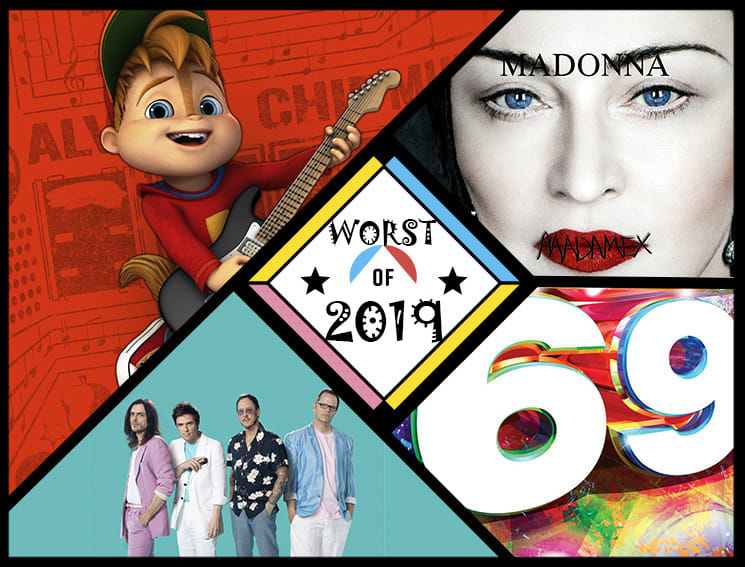
Unfortunately, despite our best annual efforts, another group of people most certainly did not get the memo, and wrapped their work in the most appallingly unappealing art they could come up with. And, well, it's really fun to dig into it all.
As such, pop a Gravol and try not to get too nauseous as we dig into the 29 worst album covers of 2019. (And while you're at it, revisit the worst album covers from 2016, 2017 and 2018.)
29. Various Artists
Now That's What I Call Music! 69
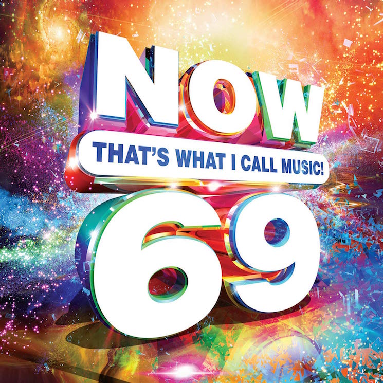
This release has been an inevitable possibility since the Now series launched in 1983, but that doesn't make this any less absurd. Could they have changed the design so the number wasn't so prominently featured? Could they have leaned in on the joke further and used one of those horny naked-people typefaces? Or should we all just grow up and stop giggling at the number 69?
28. Agnostic Front
Get Loud
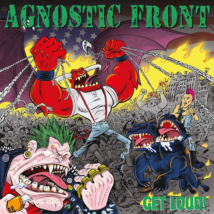
The Godfathers of Hardcore documentary recently reminded us all that Agnostic Front were once the coolest kids on the block, reinstating some goodwill that they're actively dismantling with corny decisions like this album art. This looks like a freemium mobile game about punk made by someone who's never experienced any form of punk IRL. Worse, it's actually a very well-done illustration, meaning the whole thing reeks of wasted potential.
27. Little Steven and the Disciples of Soul
Summer of Sorcery

If there's one thing that big-box online retailers have yet to destroy, it's the humble head shop. The few spots that have somehow survived via sales of studded belts, oversized Pulp Fiction posters and bootlegged Sublime with Rome iron-on patches. With its hippie dippy free font and prominent cherub's ass, this Little Steven cover packs the patchouli punch of an accidental trip to one of these stores when you're simply looking for a public washroom.
26. NANE
şmeCHERESCU
For what it's worth, this is a solid enough painting. But if you look close enough, you'll notice that NANE is eating some piping hot fries off of that poor woman's naked back. This is why it's better to stick with sushi on the naked body — there's less chance for fry grease to get into your butt crack.
25. Weezer
The Teal Album

Dressing up like a skeezy bar creep is a flip of the coin — it could be a funny way to play with your public persona, or it could solidify that you look awfully natural as a skeezy bar creep. The members of Weezer unfortunately fall hard into the latter category, especially when paired with their dollar store cologne equivalent cover of Toto's "Africa."
24. Enamity
Soft as F$$k
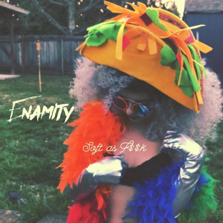
We're not sure exactly who needs to read this, but you know you're allowed to swear right? You can say "fuck" on any social media site, and you're allowed to say it in your music too (unless you're one of the 10 artists that still releases censored CDs for sale in Walmart). Hell, you're even allowed to say it on the cover of your album. It might help to distract from the fact that you're wearing a garish taco hat that looks like it's from the Halloween costume section of Petsmart.
23. S kim ja radim
Žaruljarnica

There's nothing inherently wrong with a plunger. In fact, in the worst-case scenario, a plunger can feel like a life-saving device. But does a plunger, devoid of context, work as an album cover? How about a plunger surrounded by some truly garish, Corel Draw-ass typography? The real way to get away with a plunger on the cover would've clearly been to handwrite ""Ceci n'est pas une plunger" under it.
22. Alvin & the Chipmunks
YOLO
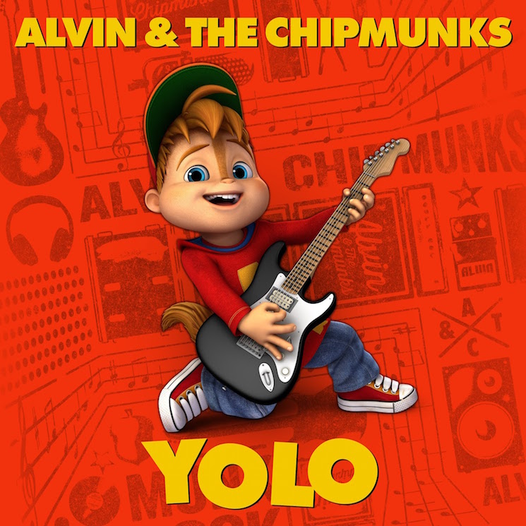
Much digital ink was spilled over just how terrifying Sonic the Hedgehog looked in 2019, but where was the outcry about nightmarishly boyish Alvin? Not only is his hyperreal skin and weird forehead treasure trail a brutal nod to the uncanny valley, but his outfit and choice of guitar have been dated since before 1997, when The Simpsons first made fun of them with Poochie. Then there's the fact that the album is called YOLO, and it's written in the Norbit font. We as a society really are failing our children.
21. Alan Parsons
The Secret

Look, when you're 70 years old and you're still making prog records you get some degree of artistic license. But this album cover looks like the world's worst children's show, the kind of thing you'd watch during a half-conscious fever dream on PBS while home sick in 1997. Worse yet, we're pretty sure the album title is in the same font as Rhonda Byrne's cultish self-help book of the same name. In fitting with the magic theme, perhaps they used Photoshop's unreliable magic wand tool to lift the type and plop it on this cover.
20. Indian Askin
Another Round

Imagine this scenario — it's a delightful Sunday afternoon, so you and your significant other decide to spend it in the park. Unfortunately, your relaxation is interrupted by a group of giggling Dutch garage rockers who would rather doodle on their friend with felt pens than take a normal photograph and add squiggly lines on the computer later on.
19. Joe Lovano, Marilyn Crispell, Carmen Castaldi
Trio Tapestry

Congrats to Lovano et. al for creating an album cover that looks exactly like the idea of jazz that all jazz haters have. Our boy Joe, just honking away into the crisp evening air, interrupting the evenings of on-lookers as they try to ignore his incessant saxing.
18. Fedez
Paranoia Airlines

A quick Google suggests this guy is an Italian rapper, but we're pretty sure he's actually the ghost of MySpace Music, forced to patrol the skies in a whimsical social media purgatory until Justin Timberlake fixes the servers and saves all of those unreleased crabcore tracks. Actually, does anyone have Michel Gondry's contact? This seems like a solid movie idea.
17. Hootie & the Blowfish
Imperfect Circle

To be fair, having a successful band that's inextricably tied to the name Hootie & the Blowfish is certainly going to be an uphill battle. But surely they could've done better than this monstrosity, which looks like a retail website's placeholder JPEG that loads when the real album cover didn't work. The font choices are mortifying, as is the weird nuclear blast/sonogram image that reveals UFOs and faces the more you stare at it. They avoided a literal interpretation of the album title, at least, but you bet your ass there's an actual blowfish hidden in the word "blowfish."
16. Marlus Viana
MVSunset

The shallow depth of field gives this cover a strangely voyeuristic quality, but rather than look at anything juicy, it feels like we're sitting in on a Saturday evening service from some hip pastor's EDM church plant in Ibiza.
15. Tyler Childers
Country Squire
The hand gestures and weirdly religious nature of this cartoon make it unclear as to whether this album cover is actually offensive or just aesthetically offensive. Either way, the image is almost hypnotically unpleasant as we imagine Tyler being visited by the ghosts of rockabilly past, present and future… and also a rooster.
14. Great Lake Swimmers
The Waves, The Wake (Acoustic)

Great Lake Swimmers' album cover for The Waves, The Wake made the cut on last year's list, and they must've taken that as a nudge to keep the momentum going. After all, the acoustic version of the album looks even worse, imagining what it would be like if you were attending your auntie's pastel drawing art opening at a funky second-wave coffee shop and then the whole building started melting like a bad acid trip.
13. Forrest Fang
The Fata Morgana Dream
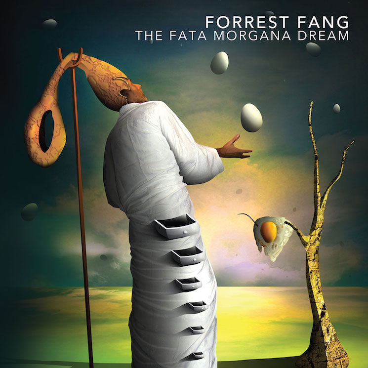
Speaking of second-wave coffee shops, the aesthetic of this Forrest Fang album looks like the kind of java joint that sells cast-iron cat art and coffee that tastes like melted crayons. Look a little closer, and you'll see that they also have an affinity for eggs at this fictional spot. Look closer still, and you'll see that the chef appears to have a detachable ballsack for a head.
12. Sean McCann
Puck

Eggs were apparently a recurring theme for the world's worst graphic designers in 2019, which can only begin to explain this baffling cover. Look, we get it — boiled eggs can be difficult to peel. But the trick is to watch the boiling time carefully, then immediately dowse the egg in an ice bath. You'll no longer need to make use of messy medieval mallets in the kitchen.
11. Westimate
Never Underwestimate Me
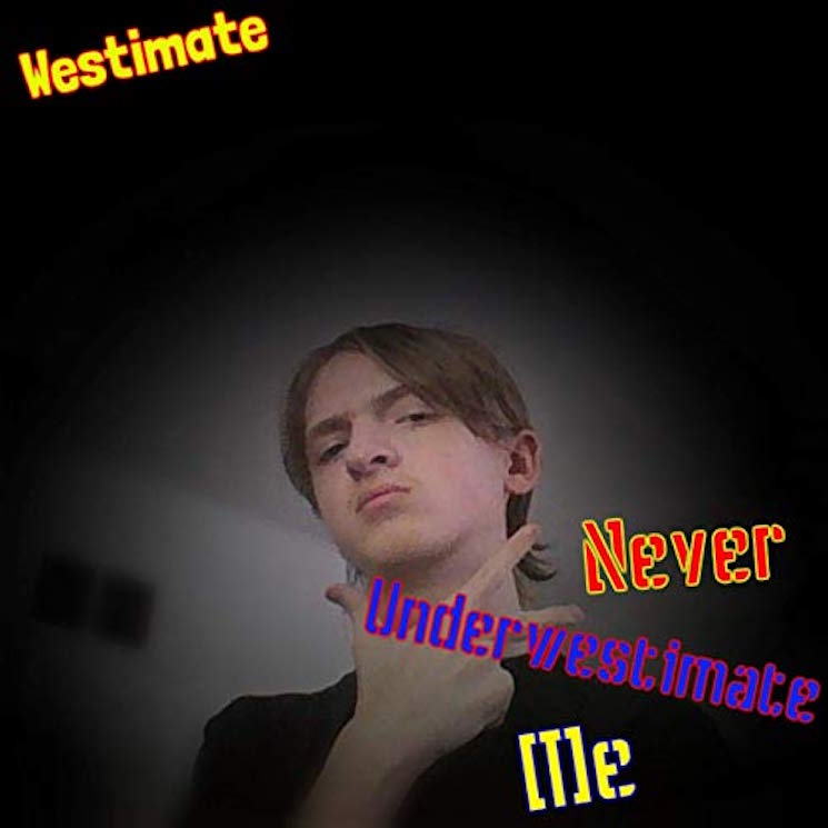
We're awfully sorry, Westimate, but this cover art will, in fact, make us underwestimate you. In fact, the level with which you're westimated is up to you to decide. If anything, by slapping this cover on your rap album, you've underwestimated yourself. We're not even mad — just wesappointed.
10. Jordan Rudess
Wired for Madness

Where to begin? This dude's bright white goatee is lost in the clouds, and he's got musical notes for sideburns. And that's not even touching on his half-faced steampunk mask. Wired for Madness is a fitting title, because this is definitely the kind of guy who has a massive pile of dusty old Wired magazine issues stacked next to the gaming computer he uses to make his tunes.
9. Stez Mutiny
We Are the Ocean
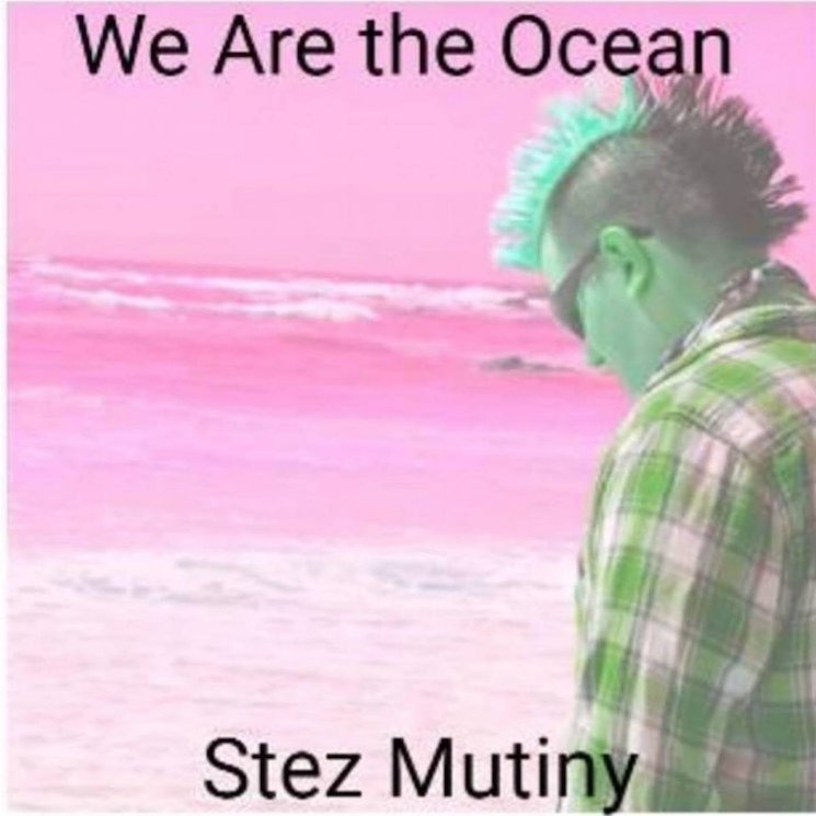
Yes, the album art is bad. But we've still gotta hand it to folk punk artist Stez Mutiny for the authenticity of this art work. After all, this looks like it was printed on a bubblejet printer, placed in a CD-R case and lost on the damp floor of a Ford Focus before being scanned and uploaded to Bandcamp. Assuming Stez actually designed it that way, that's a hell of a lot of effort.
8. Rob Halford with Family & Friends
Celestial

If Rob Halford was our uncle, we'd absolutely love to slap this up on the side of our fridge as a family greeting card. But as the cover of a Christmas album, it's more sad blues dad than veteran metal legend. Plus, he's been elongated in the bad Photoshop stretch, making him look like even more of a wise hologram that guides us through an MMORPG.
7. DJ Shadow
Our Pathetic Age
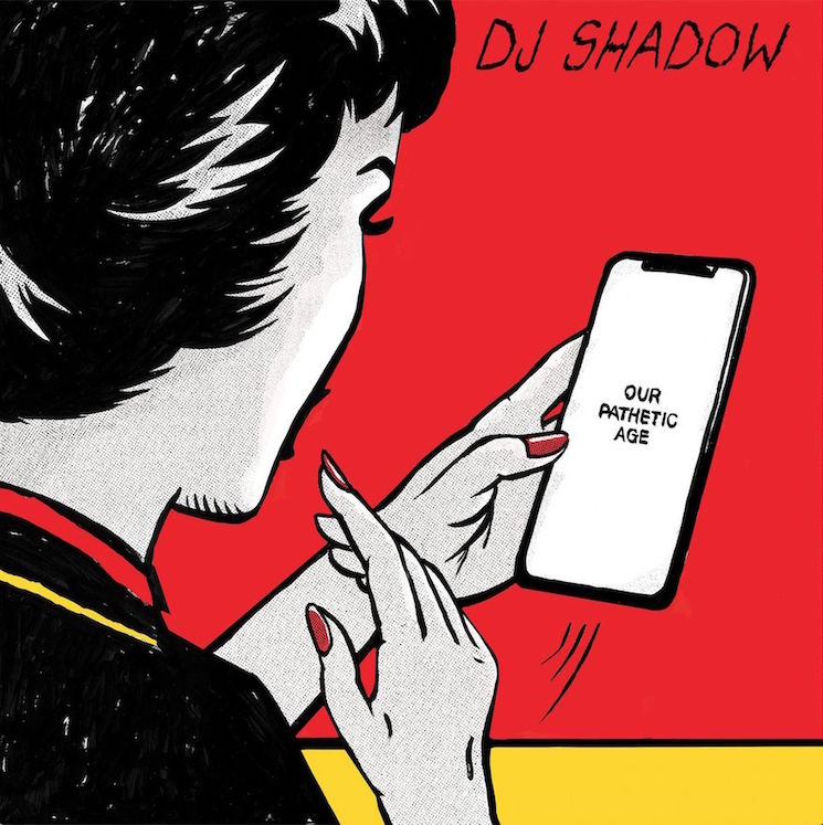
It's bad enough that DJ Shadow is doing the bad fake-Banksy "society nowadays" messaging with a cellphone that reads "our pathetic age" on it. But the juxtaposition of modern imagery with a 1950s housewife aesthetic also reminds us of those snarky Gen. X greeting cards that are all about secretly sipping vodka and saying the C-word. So many bad vibes at once.
6. Mononeon
Living the Best and Worst Life at the Same Damn Time!

It's honestly impressive that one image could be so incredibly draining, but the album title is only half true because there's no "best" to be had here. Instead, we're just so tired. So very tired.
5. Hug
A Young Person's Guide to Hug

Look, we're not being bamboozled. We're aware that this was released on the indie label Joyful Noise for a curated white-label vinyl series from experimental artist Thor Harris. But being experimental and pushing the boundaries of taste doesn't make this image any less jarring. This is the phrase "Why be normal?" personified, and it makes us want to listen to nothing but straight-laced corporate rock from now on.
4. Madonna
Madame X

Perhaps less noticeable is the awkward placement of "MADONNA," which looks like it was slapped on the JPEG in a free poster app on some intern's iPhone. But the real star of the show is Madonna's sewn up mouth, which further highlights how much this album title sounds like the overwrought name of a female Bond villain. She could have at least committed to the bit and sang the whole album with her mouth sewn shut.
3. The Thing
Maybe Time
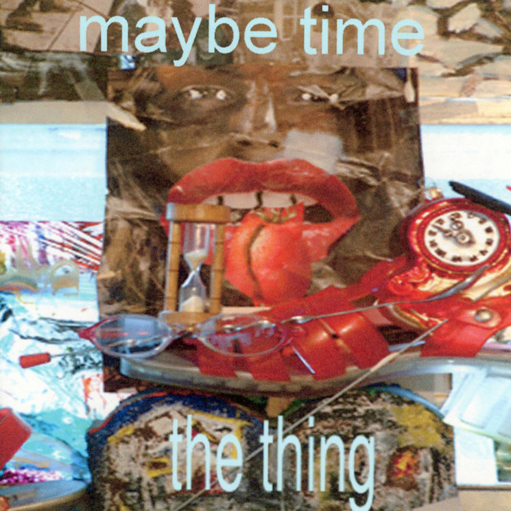
If we had to say something positive about this album cover, we'd say that it's impressive how one lo-res JPEG could manage to so accurately sum up the nausea of a trip to the garbage dump on an empty stomach in the midst of a piping hot summer's afternoon, its pungent aromas intoxicating your senses and making you wish your hunger wasn't preventing you from throwing up. In that sense, it's a truly immersive piece of art.
2. Pink
Hurts 2B Human

Incredibly, this cover feels like an amalgamation of every Grade 10 art student's final class project ever to be begrudgingly hung in every family's spare room. Its a summation of all bad suburban art ever made, a stunning achievement in middle class mediocrity and a testament to the powerful place that P!nk holds in the normie zeitgeist.
1. Chocolate Watchband
This Is My Voice
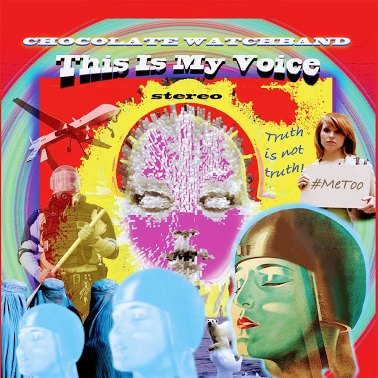
Still, no normie can compete with the power of aging proto-punks, as evidenced by this baffling disasterpiece from the veteran California psych rock group Chocolate Watchband. The cover art for This Is My Voice is an incredibly jarring work, showcasing signs of the times that include riot police, drones, a lone polar bear, the three wise men (?) and a lady's face that almost resembles Converge's iconic Jane Doe artwork if it was designed in Minecraft. Then there's a young gal holding up a #MeToo protest sign beside some word art that says "Truth is not truth!" Whatever they're trying to say with this art might be revealed through the music within, but the cover stands on its own as a perfect representation of our times: confusing, enraging, nauseating and utterly terrifying.
Unfortunately, despite our best annual efforts, another group of people most certainly did not get the memo, and wrapped their work in the most appallingly unappealing art they could come up with. And, well, it's really fun to dig into it all.
As such, pop a Gravol and try not to get too nauseous as we dig into the 29 worst album covers of 2019. (And while you're at it, revisit the worst album covers from 2016, 2017 and 2018.)
29. Various Artists
Now That's What I Call Music! 69
This release has been an inevitable possibility since the Now series launched in 1983, but that doesn't make this any less absurd. Could they have changed the design so the number wasn't so prominently featured? Could they have leaned in on the joke further and used one of those horny naked-people typefaces? Or should we all just grow up and stop giggling at the number 69?
28. Agnostic Front
Get Loud
The Godfathers of Hardcore documentary recently reminded us all that Agnostic Front were once the coolest kids on the block, reinstating some goodwill that they're actively dismantling with corny decisions like this album art. This looks like a freemium mobile game about punk made by someone who's never experienced any form of punk IRL. Worse, it's actually a very well-done illustration, meaning the whole thing reeks of wasted potential.
27. Little Steven and the Disciples of Soul
Summer of Sorcery
If there's one thing that big-box online retailers have yet to destroy, it's the humble head shop. The few spots that have somehow survived via sales of studded belts, oversized Pulp Fiction posters and bootlegged Sublime with Rome iron-on patches. With its hippie dippy free font and prominent cherub's ass, this Little Steven cover packs the patchouli punch of an accidental trip to one of these stores when you're simply looking for a public washroom.
26. NANE
şmeCHERESCU
For what it's worth, this is a solid enough painting. But if you look close enough, you'll notice that NANE is eating some piping hot fries off of that poor woman's naked back. This is why it's better to stick with sushi on the naked body — there's less chance for fry grease to get into your butt crack.
25. Weezer
The Teal Album
Dressing up like a skeezy bar creep is a flip of the coin — it could be a funny way to play with your public persona, or it could solidify that you look awfully natural as a skeezy bar creep. The members of Weezer unfortunately fall hard into the latter category, especially when paired with their dollar store cologne equivalent cover of Toto's "Africa."
24. Enamity
Soft as F$$k
We're not sure exactly who needs to read this, but you know you're allowed to swear right? You can say "fuck" on any social media site, and you're allowed to say it in your music too (unless you're one of the 10 artists that still releases censored CDs for sale in Walmart). Hell, you're even allowed to say it on the cover of your album. It might help to distract from the fact that you're wearing a garish taco hat that looks like it's from the Halloween costume section of Petsmart.
23. S kim ja radim
Žaruljarnica
There's nothing inherently wrong with a plunger. In fact, in the worst-case scenario, a plunger can feel like a life-saving device. But does a plunger, devoid of context, work as an album cover? How about a plunger surrounded by some truly garish, Corel Draw-ass typography? The real way to get away with a plunger on the cover would've clearly been to handwrite ""Ceci n'est pas une plunger" under it.
22. Alvin & the Chipmunks
YOLO
Much digital ink was spilled over just how terrifying Sonic the Hedgehog looked in 2019, but where was the outcry about nightmarishly boyish Alvin? Not only is his hyperreal skin and weird forehead treasure trail a brutal nod to the uncanny valley, but his outfit and choice of guitar have been dated since before 1997, when The Simpsons first made fun of them with Poochie. Then there's the fact that the album is called YOLO, and it's written in the Norbit font. We as a society really are failing our children.
21. Alan Parsons
The Secret
Look, when you're 70 years old and you're still making prog records you get some degree of artistic license. But this album cover looks like the world's worst children's show, the kind of thing you'd watch during a half-conscious fever dream on PBS while home sick in 1997. Worse yet, we're pretty sure the album title is in the same font as Rhonda Byrne's cultish self-help book of the same name. In fitting with the magic theme, perhaps they used Photoshop's unreliable magic wand tool to lift the type and plop it on this cover.
20. Indian Askin
Another Round
Imagine this scenario — it's a delightful Sunday afternoon, so you and your significant other decide to spend it in the park. Unfortunately, your relaxation is interrupted by a group of giggling Dutch garage rockers who would rather doodle on their friend with felt pens than take a normal photograph and add squiggly lines on the computer later on.
19. Joe Lovano, Marilyn Crispell, Carmen Castaldi
Trio Tapestry
Congrats to Lovano et. al for creating an album cover that looks exactly like the idea of jazz that all jazz haters have. Our boy Joe, just honking away into the crisp evening air, interrupting the evenings of on-lookers as they try to ignore his incessant saxing.
18. Fedez
Paranoia Airlines
A quick Google suggests this guy is an Italian rapper, but we're pretty sure he's actually the ghost of MySpace Music, forced to patrol the skies in a whimsical social media purgatory until Justin Timberlake fixes the servers and saves all of those unreleased crabcore tracks. Actually, does anyone have Michel Gondry's contact? This seems like a solid movie idea.
17. Hootie & the Blowfish
Imperfect Circle
To be fair, having a successful band that's inextricably tied to the name Hootie & the Blowfish is certainly going to be an uphill battle. But surely they could've done better than this monstrosity, which looks like a retail website's placeholder JPEG that loads when the real album cover didn't work. The font choices are mortifying, as is the weird nuclear blast/sonogram image that reveals UFOs and faces the more you stare at it. They avoided a literal interpretation of the album title, at least, but you bet your ass there's an actual blowfish hidden in the word "blowfish."
16. Marlus Viana
MVSunset
The shallow depth of field gives this cover a strangely voyeuristic quality, but rather than look at anything juicy, it feels like we're sitting in on a Saturday evening service from some hip pastor's EDM church plant in Ibiza.
15. Tyler Childers
Country Squire
The hand gestures and weirdly religious nature of this cartoon make it unclear as to whether this album cover is actually offensive or just aesthetically offensive. Either way, the image is almost hypnotically unpleasant as we imagine Tyler being visited by the ghosts of rockabilly past, present and future… and also a rooster.
14. Great Lake Swimmers
The Waves, The Wake (Acoustic)
Great Lake Swimmers' album cover for The Waves, The Wake made the cut on last year's list, and they must've taken that as a nudge to keep the momentum going. After all, the acoustic version of the album looks even worse, imagining what it would be like if you were attending your auntie's pastel drawing art opening at a funky second-wave coffee shop and then the whole building started melting like a bad acid trip.
13. Forrest Fang
The Fata Morgana Dream
Speaking of second-wave coffee shops, the aesthetic of this Forrest Fang album looks like the kind of java joint that sells cast-iron cat art and coffee that tastes like melted crayons. Look a little closer, and you'll see that they also have an affinity for eggs at this fictional spot. Look closer still, and you'll see that the chef appears to have a detachable ballsack for a head.
12. Sean McCann
Puck
Eggs were apparently a recurring theme for the world's worst graphic designers in 2019, which can only begin to explain this baffling cover. Look, we get it — boiled eggs can be difficult to peel. But the trick is to watch the boiling time carefully, then immediately dowse the egg in an ice bath. You'll no longer need to make use of messy medieval mallets in the kitchen.
11. Westimate
Never Underwestimate Me
We're awfully sorry, Westimate, but this cover art will, in fact, make us underwestimate you. In fact, the level with which you're westimated is up to you to decide. If anything, by slapping this cover on your rap album, you've underwestimated yourself. We're not even mad — just wesappointed.
10. Jordan Rudess
Wired for Madness
Where to begin? This dude's bright white goatee is lost in the clouds, and he's got musical notes for sideburns. And that's not even touching on his half-faced steampunk mask. Wired for Madness is a fitting title, because this is definitely the kind of guy who has a massive pile of dusty old Wired magazine issues stacked next to the gaming computer he uses to make his tunes.
9. Stez Mutiny
We Are the Ocean
Yes, the album art is bad. But we've still gotta hand it to folk punk artist Stez Mutiny for the authenticity of this art work. After all, this looks like it was printed on a bubblejet printer, placed in a CD-R case and lost on the damp floor of a Ford Focus before being scanned and uploaded to Bandcamp. Assuming Stez actually designed it that way, that's a hell of a lot of effort.
8. Rob Halford with Family & Friends
Celestial
If Rob Halford was our uncle, we'd absolutely love to slap this up on the side of our fridge as a family greeting card. But as the cover of a Christmas album, it's more sad blues dad than veteran metal legend. Plus, he's been elongated in the bad Photoshop stretch, making him look like even more of a wise hologram that guides us through an MMORPG.
7. DJ Shadow
Our Pathetic Age
It's bad enough that DJ Shadow is doing the bad fake-Banksy "society nowadays" messaging with a cellphone that reads "our pathetic age" on it. But the juxtaposition of modern imagery with a 1950s housewife aesthetic also reminds us of those snarky Gen. X greeting cards that are all about secretly sipping vodka and saying the C-word. So many bad vibes at once.
6. Mononeon
Living the Best and Worst Life at the Same Damn Time!
It's honestly impressive that one image could be so incredibly draining, but the album title is only half true because there's no "best" to be had here. Instead, we're just so tired. So very tired.
5. Hug
A Young Person's Guide to Hug
Look, we're not being bamboozled. We're aware that this was released on the indie label Joyful Noise for a curated white-label vinyl series from experimental artist Thor Harris. But being experimental and pushing the boundaries of taste doesn't make this image any less jarring. This is the phrase "Why be normal?" personified, and it makes us want to listen to nothing but straight-laced corporate rock from now on.
4. Madonna
Madame X
Perhaps less noticeable is the awkward placement of "MADONNA," which looks like it was slapped on the JPEG in a free poster app on some intern's iPhone. But the real star of the show is Madonna's sewn up mouth, which further highlights how much this album title sounds like the overwrought name of a female Bond villain. She could have at least committed to the bit and sang the whole album with her mouth sewn shut.
3. The Thing
Maybe Time
If we had to say something positive about this album cover, we'd say that it's impressive how one lo-res JPEG could manage to so accurately sum up the nausea of a trip to the garbage dump on an empty stomach in the midst of a piping hot summer's afternoon, its pungent aromas intoxicating your senses and making you wish your hunger wasn't preventing you from throwing up. In that sense, it's a truly immersive piece of art.
2. Pink
Hurts 2B Human
Incredibly, this cover feels like an amalgamation of every Grade 10 art student's final class project ever to be begrudgingly hung in every family's spare room. Its a summation of all bad suburban art ever made, a stunning achievement in middle class mediocrity and a testament to the powerful place that P!nk holds in the normie zeitgeist.
1. Chocolate Watchband
This Is My Voice
Still, no normie can compete with the power of aging proto-punks, as evidenced by this baffling disasterpiece from the veteran California psych rock group Chocolate Watchband. The cover art for This Is My Voice is an incredibly jarring work, showcasing signs of the times that include riot police, drones, a lone polar bear, the three wise men (?) and a lady's face that almost resembles Converge's iconic Jane Doe artwork if it was designed in Minecraft. Then there's a young gal holding up a #MeToo protest sign beside some word art that says "Truth is not truth!" Whatever they're trying to say with this art might be revealed through the music within, but the cover stands on its own as a perfect representation of our times: confusing, enraging, nauseating and utterly terrifying.