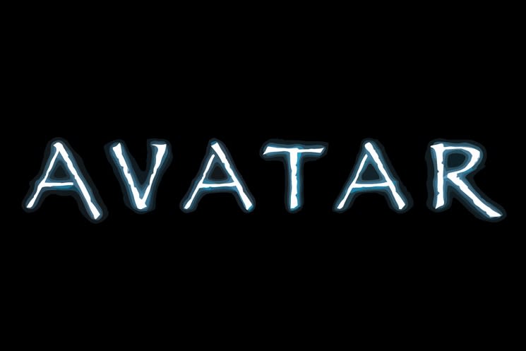
Avatar's use of a slightly modified Papyrus font has been the subject of much mockery since the film's 2009 release, most notably in an SNL sketch starring Ryan Gosling. Now, the whole backstory behind the font choice has been revealed, and it turns out that it wasn't a careless decision at all.
The design company BLT Communications reportedly presented studio execs at 20th Century Fox with "75 to 90" logos that "were all chrome and futuristic and it just was not right," according to marketing exec Peter Stougaard [via The Ringer], who takes responsibility for the eventual font choice. These futuristic logos apparently didn't fit Cameron's vision for the indigenous Na'vi people.
Eventually, Stougaard bumped into Cameron at the Fox studio, and noticed that Cameron was carrying the same Avatar script that he'd had with him for the past five years — and it featured a title page written in Papyrus. From there, Stougaard himself tweaked the font in Photoshop and the logo was made. Stougaard said that Cameron had seemingly become attached to the font after having seen it on his script for so long, although it's not clear if he was the one who actually selected it for the script cover.
The studio commissioned a custom font modelled after Papyrus, but the filmmakers ended up being so attached to Papyrus that they pushed back and kept returning to the original thing. In the end, the subtitles are in straight-up Papyrus, while the end titles feature a vertically stretched version of Papyrus.
"I had to do my job, which was to deliver a poster to theatres for the most expensive movie we've ever worked on," said Stougaard. "I couldn't see it as a cheap font. I had to see it as James Cameron's font."
Read The Ringer's deep dive here. Avatar's sequel, The Way of Water, is out this Friday (December 16), and straight-up Papyrus is not featured. The decision to ditch Papyrus had apparently been made before the SNL sketch.


