As well as being the co-founder of Toronto indie institution Hand Drawn Dracula, James Mejia is a graphic designer who has been nominated at the JUNO Awards three times for Recording Package of the Year.
That makes him the perfect person to turn to for an appraisal of our list of the worst album covers of 2024 (as well as our staffers' favourite album art of the year). He highlights some of the "hauntingly gross and questionable" standouts from the list, as well as the one he is disappointed to see included, and names some of his own personal faves from 2024.
He also reflects on the highs and lows of his experience as a graphic designer working with Wintersleep, Ron Sexsmith, Tallies and others, and shares his thoughts on what makes an album cover great.
What are the most important things to consider when creating an album cover?
The music and theme of the album, the aesthetic direction established by the band, or where they would like to go with a visual direction. Some musicians are very involved in the process, they have artwork or photographs already in mind, and others are open to anything — a good line of communication and sharing of ideas is important to get a project started. The entire design of a package is also important to keep in mind: the choice of stock, inks and finishes, and the layout of credits, lyrics and photos all contributes to the overall identity of the project and artist.
What did you think of our list of the worst album covers of 2024?
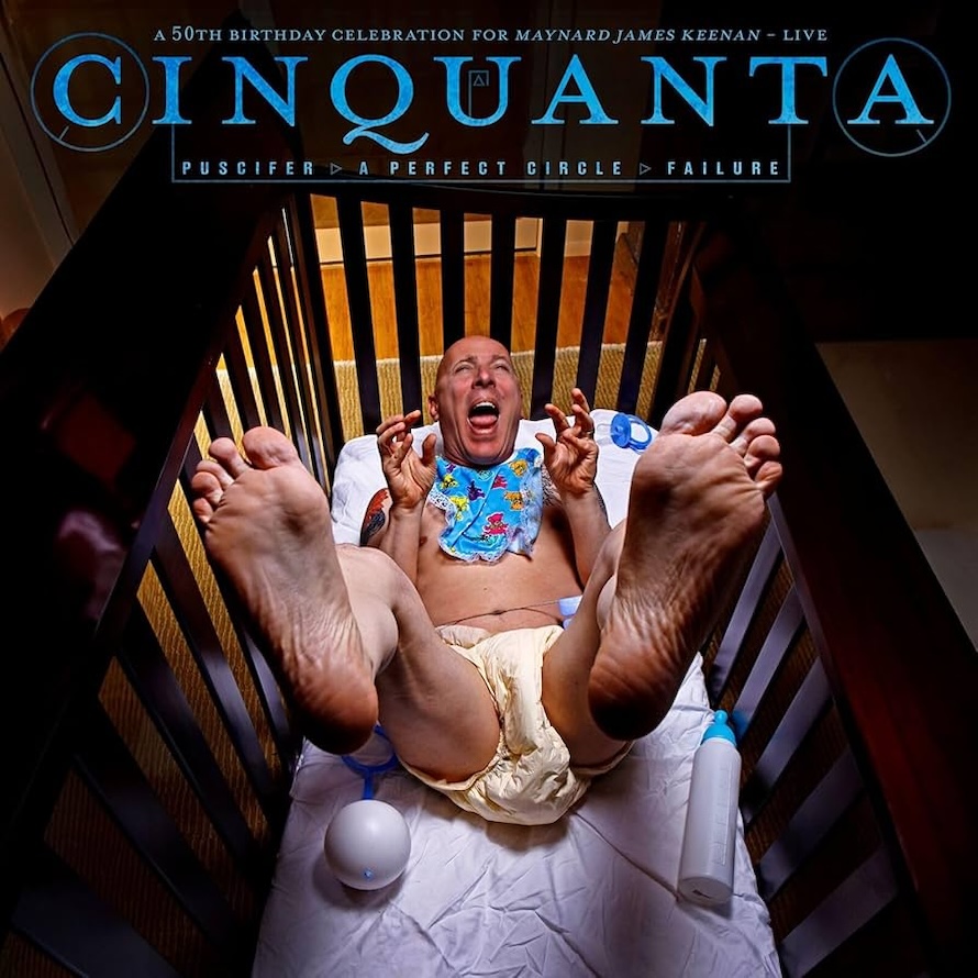
The first time seeing that Maynard James Kenan album, you just knew that was topping the list. The Exclaim! worst-of selections are pretty on point — lots of hauntingly gross and questionable album covers. I was a little sad to see Sebastian Bach's cover up there. I haven't heard the album, but I know it was a combination of works by his late father, David Bierk, who is a well-noted and collected Canadian painter. So that was a sentimental choice and I can respect that.
What did you think of our staffers' pickers of our favourite album covers of 2024?
It's a great list of favourite album covers. Mimi by Corridor and I Got Heaven by Mannequin Pussy both really stood out on store shelves this past year. I also really liked the artwork for METZ's Up on Gravity Hill. Chat Pile's Cool World has a great established branding that sort of has a Harmony Korine type of narrative aesthetic that Ethel Cain and Chastity also masterfully build within their visual settings. One of the most ingenious package designs this year is A Place to Bury Strangers' Synthesizer. ABTBS' wizard, Oliver Ackermann, designed the cover to be an actual playable circuit board/synth with his signature Death by Audio pedals graphic look.

Which of the album covers you designed are you particularly proud of?
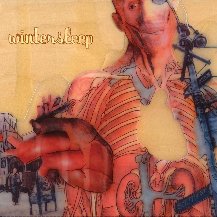
I really liked the art direction, logo design and album covers I worked on for Tallies' albums and singles. I really wanted to match their dream pop shoegaze sound with a nod back to some of my favourite designers working with similar sounding bands from the '90s. I'm also particularly proud of the artwork I did on Wintersleep's Untitled from 2006. Around that time, I was developing that wood canvas style and showing the artwork mostly at Spin Gallery. I adapted the style to make original pieces for Wintersleep's limited vinyl pressing, the CD artwork, and for an animated music video.
Are there any album covers that you created that you regret, or wish could have been better?
I'm pretty happy with the projects I've worked on. But you do kind of know when you worked on a "hit" when everything falls perfectly into place. And of course there's always room for improvement, especially in the early days when I was still developing technical skills. Also, today's software and manufacturing is far more advanced and collaborative, which makes a huge difference in the quality of the final print.
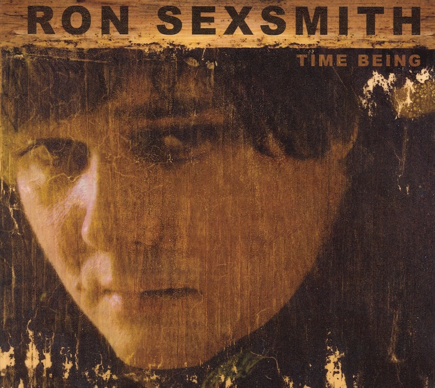
I still have the wooden art pieces I made for Ron Sexsmith's Time Being and I wish I could have made better scans of them. The final album design ended being darker then I intended and the colour correction a little off. But the overall design is great, with Ron's drawings throughout the lyric booklet. So there are probably a handful of those type of technical issues I wish I could correct these days.
What's your favourite album cover of all time?
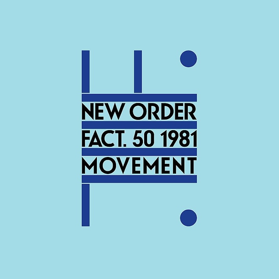
That feels like an impossible question. It always changes and depends on the day. I can say my main influences include Peter Saville's Factory era art direction, Vaughan Oliver's early 4AD era in particular but really his entire collection of work, Jonathan Barnbrook's art direction on the later Bowie albums, and David Carson's work on ['90s rock magazine] Ray Gun. Also everything Floria Sigismondi and Jesse Draxler create is stunning.
