Being a kick-ass metal band has many prerequisites: black clothes, some big-ass amps, lots of killer riffs and wicked tunes. Of course, none of that means anything if you don't have a sweet logo to promote your product. Luckily, The Grid TO has put together a guide to help you navigate the world of heavy metal logos.
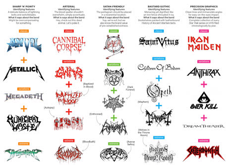
Clearly, the metal community contains some like-minded artists, since the famous logos featured fit comfortably into five distinct categories. See a close-up image here or follow the breakdown below:
-Sharp 'n' Pointy: Jagged fonts that would work well as throwing stars (Metallica, Anvil and Megadeth).
-Arterial: Blood-splattered images that remind you in no uncertain terms just how killer the band is (Cannibal Corse, GWAR). As you can see from the guide, these are often hard to read. Does that seriously say Bloodbath?
-Satan-Friendly: Devil-worshipping logos, typically featuring the pentagram. (Slayer)
-Bastard Gothic: Archaic, calligraphy-style fonts (Children of Bodom, Opeth). Because nothing says "heavy metal" quite like an actual suit of armour.
-Precision Graphics: Think Sharp 'n' Pointy, just a little less violent (Iron Maiden, Anthrax, Dream Theatre).
On a related note, scroll down to see an instructional video on making a cool heavy metal logo. A few years back, MTV put together a list on the "Top 10 Most Illegible Metal Logos" (Bloodbath is only at No. 8!).
Here's hoping that someone creates a breakdown of all the classic rap logos: violent (Public Enemy, Death Row Records), near-symmetrical (Eminem, Run DMC), classy (Outkast), etc.