Limp Bizkit have unquestionably blown past the mid-life crisis of their career, to the point where guitarist Wes Borland feels trapped and their most popular concerts are fictional gas station performances. That the long-running nü-metal rap-rock band would feel the need for a rebrand makes sense.
Unfortunately, they've gone about it in the worst way imaginable. Over on their social media pages, the Biz have shared a pair of new logos with predictably terrible results.
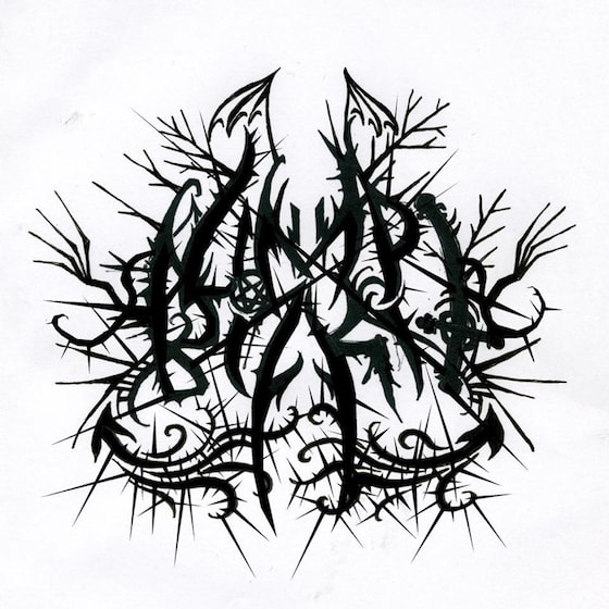
Above, you'll see Limp Bizkit's new, black metal-inspired logo. Rather than looking like the illegible, unholy screed of a Norwegian monster, however, their black metal-inspired iconography looks as if it was scrawled in the opening pages of a remedial math textbook.
Looking a little closer, the black metal logo features both a Celtic cross and a pentagram. Spooky!
As if that weren't bad enough, they've also shared a slicker (but no less awful) logo that features spread wings, a skull, emo stars, a spade, a lightning bolt and a misspelled abbreviation of the word "until." It sort of looks like an Affliction shirt that would be worn by a fledgling Las Vegas illusionist.
Unfortunately, they've gone about it in the worst way imaginable. Over on their social media pages, the Biz have shared a pair of new logos with predictably terrible results.
Above, you'll see Limp Bizkit's new, black metal-inspired logo. Rather than looking like the illegible, unholy screed of a Norwegian monster, however, their black metal-inspired iconography looks as if it was scrawled in the opening pages of a remedial math textbook.
Looking a little closer, the black metal logo features both a Celtic cross and a pentagram. Spooky!
As if that weren't bad enough, they've also shared a slicker (but no less awful) logo that features spread wings, a skull, emo stars, a spade, a lightning bolt and a misspelled abbreviation of the word "until." It sort of looks like an Affliction shirt that would be worn by a fledgling Las Vegas illusionist.
Thanks to MetalSucks for ruining our day.