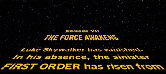
Star Wars: The Force Awakens was a massive people pleaser thanks to the way Disney and J.J. Abrams captured the spirit of the original three films. If you're the sort of typography nerd who gets off on subtle font differences, however, you might have been left a little cold by the film's opening crawl.
According to /Film, some astute typography fans have obsessively gone over the iconic Star Wars text at the start of the film, only to determine that its producers used the wrong typeface.
A Medium user aptly named FixTheCrawl has gone to great lengths to blast The Force Awakens producers for their irresponsible typography.
To save you some time, the essay points out that The Force Awakens uses a condensed version of News Gothic rather than Univers, Ultra Condensed. It's like these damn clowns have never studied sans serif typefaces before!
If you feel like getting into some font theory, here's how FixTheCrawl explains the muck-up:
News Gothic (also used for the body text) is very round, friendly, and readable, whereas Univers gives the title of the film some stately heft — telegraphing the impression that the events about to transpire are carved in the stone of destiny (or something). … It's subtle, but noticable. The 'S' and 'R' glyphs, in particular, are very different. Overall, it's boxier, and feels more staid. Less urgent.
According to Lucasfilm Story Group head Pablo Hidalgo, the changed crawl was approved by director J.J. Abrams, who is himself an outspoken typography nerd.
While font fans continue to freak over the subtle difference in The Force Awakens, the rest of us can just continue to be thankful that the producers didn't use Comic Sans or, in the tradition of Avatar, Papyrus.